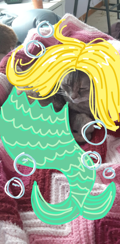
feedbackI enjoyed this assignment a lot! I like that we have a lot of freedom to create whatever we want. I also liked doing this assignment because I like to draw anyway, and I had fun putting it together.
2 Comments
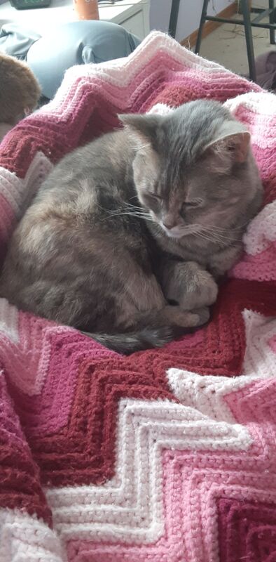
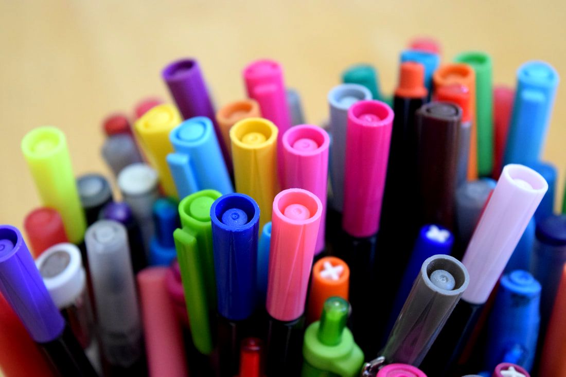 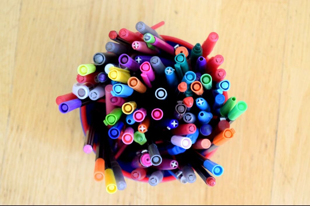  feedbackI thought this was a fun assignment! I enjoyed going around my house trying to spot interesting colors and color combinations. I also had fun practicing with different angles. When I found a colorful subject to photograph, I would try to exhaust my options for angles. Overall, I think this was a pretty good, straightforward assignment.
assignment descriptionFor our first assignment, we were to research the nine principles of design--including balance, movement, repetition and rhythm, emphasis, simplicity, contrast, proportion, space, and unity. After getting an idea of what all of these principles meant in terms of photography, we went out and took one photograph that represented each principle. balance Balance is in reference to a balanced visual weight. This photograph represents balance due to the symmetrical nature of it. The vertical symmetry allows for a balanced feel on both the left and right sides of the photo. movement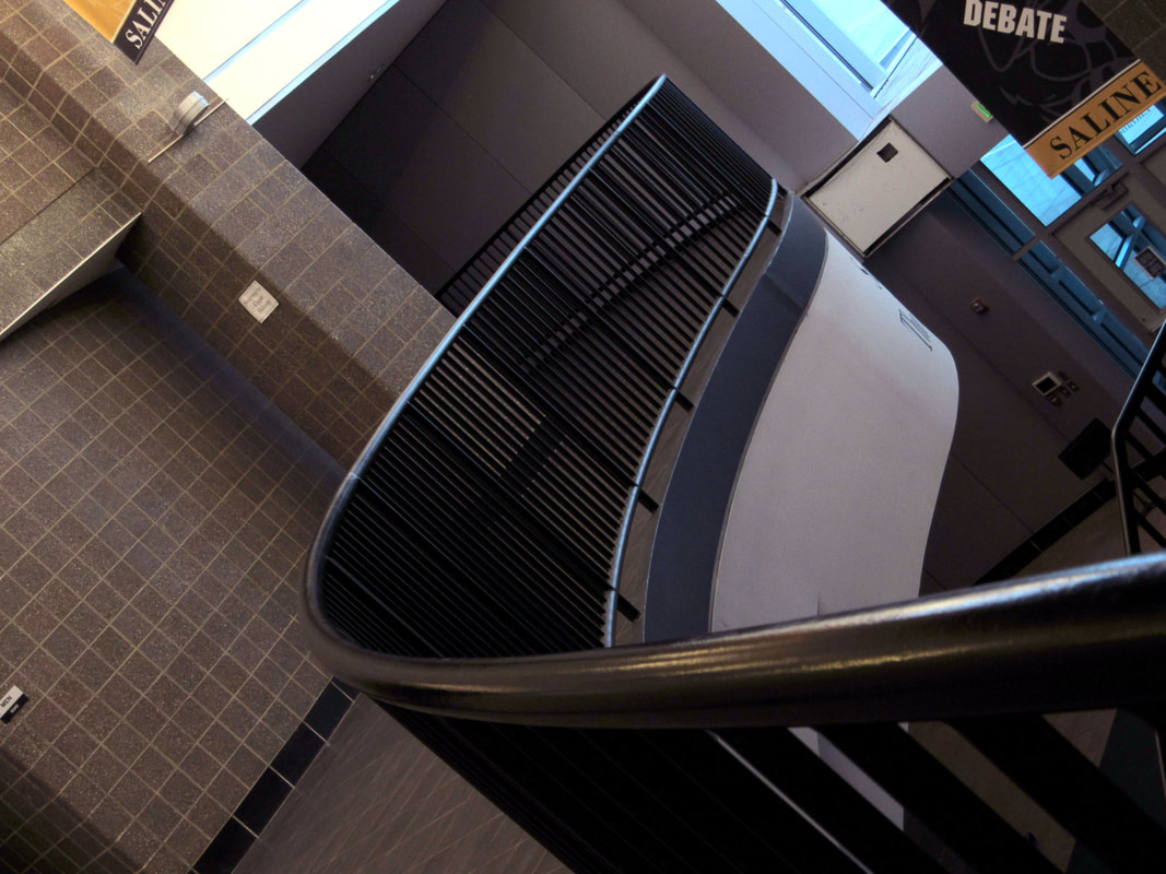 Movement in a photo is the movement of the viewer's eye. The way the rail curves and leads away from the camera is meant to move the viewer's eye along its path. repetition & rhythm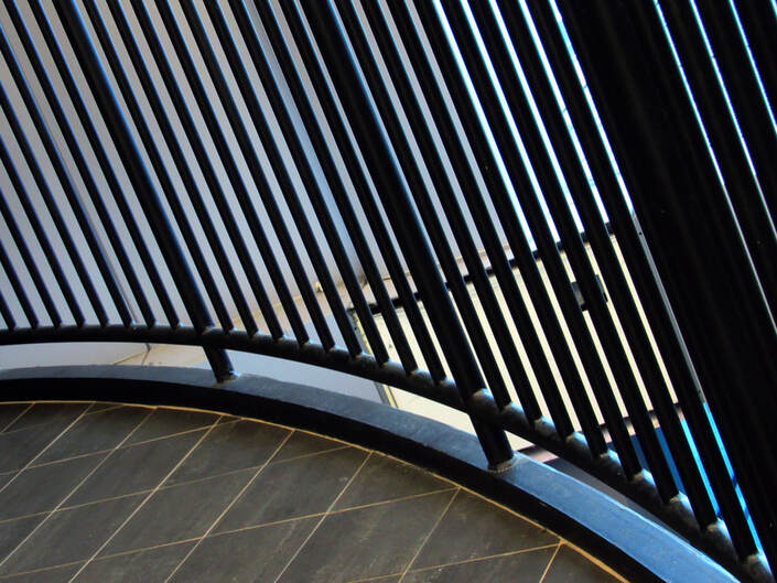 Repetition is when like elements are repeated regularly or irregularly. This photo showcases repetition because the black lines continually repeat as they curve away. Rhythm--movement due to the repetition--is present as well, because the separation between the black lines gets greater as they move further away from the camera. This creates a path from right to left for the viewer's eye. emphasis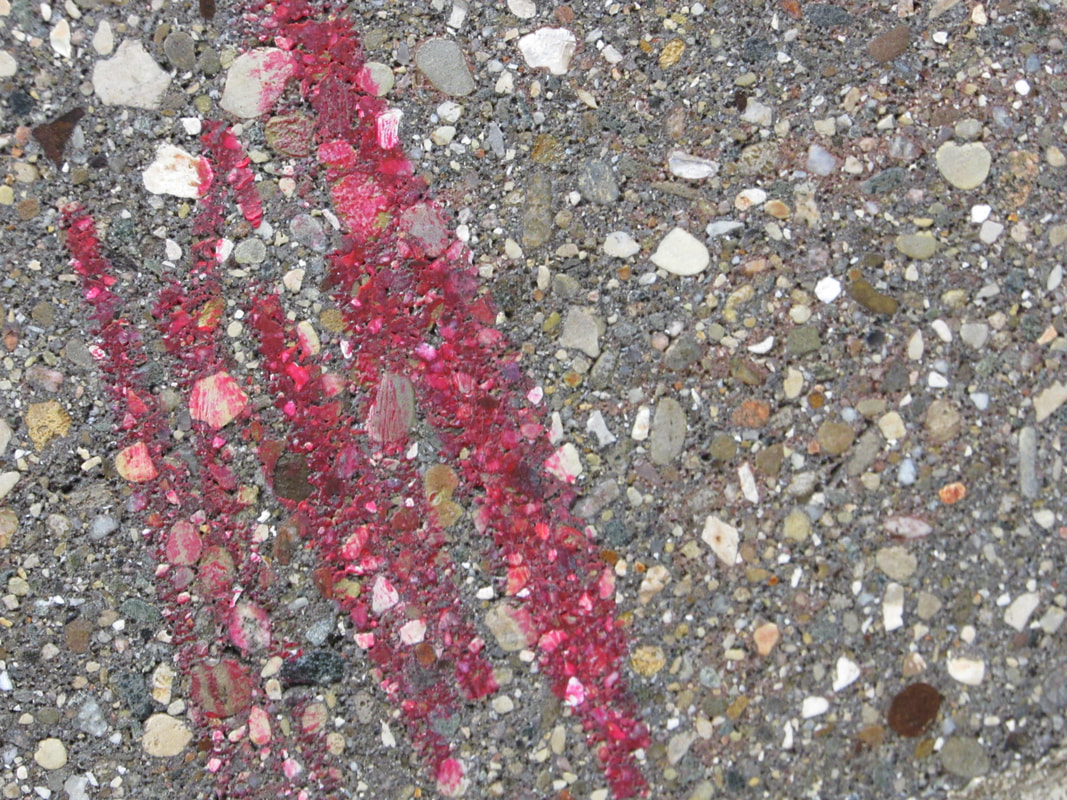 Emphasis is when one element or area is attracting attention. I took this photo to represent emphasis because I felt that there was a clear emphasis on these bright red streaks against the neutral grays and browns on the wall. Nothing else is competing for the focal point. simplicity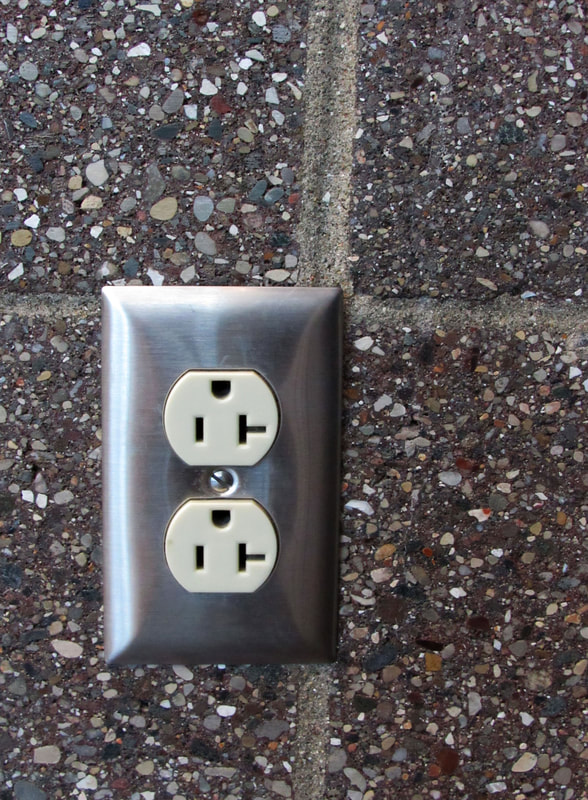 Simplicity, or visual economy, is the practice of omitting all non-essential or unimportant elements. I thought this photo represented simplicity well because there is really only one subject in the photo: the outlets. I got really close to this subject in order to eliminate any other distractions. contrast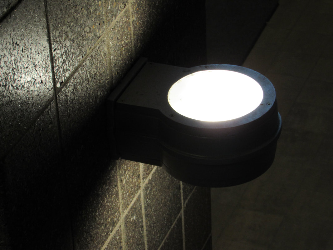 Contrast is the positioning of strikingly opposing elements. This photo is an example of contrast in value--the brightest, whitest light next to the darkest, blackest shadows. proportion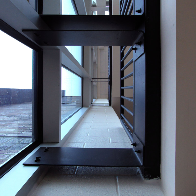 Proportion is in reference to the comparison between size, color, quantity, degree, setting, et cetera. I chose this image for proportion because I noticed how the proportion of the beams and bricks changes as they get further away from the camera--they appear smaller. space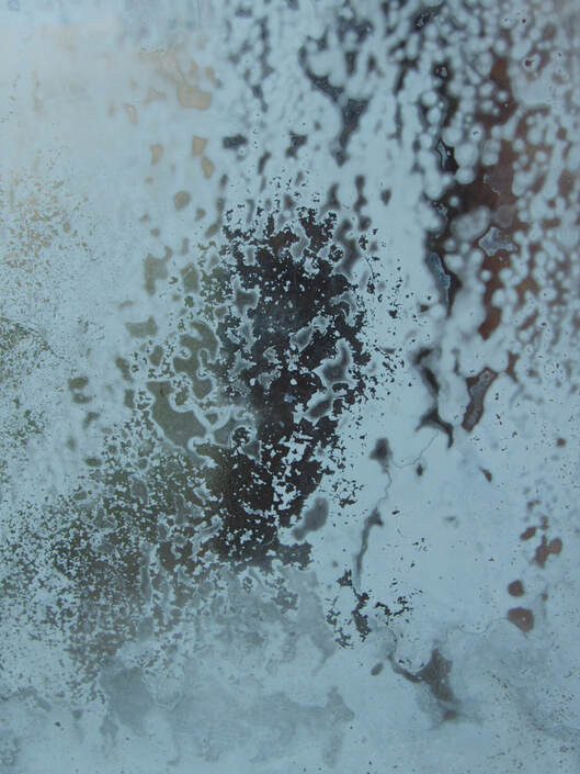 A photo that focuses on the principle of space emphasizes the use of positive and negative space. This image represents space because positive and negative space work together to make up a pattern in the glass (this is frost on a window). The positive space consists of the frost, while the negative space is where there is no frost. unity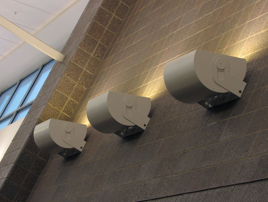 Unity occurs when all design elements work harmoniously together. This photograph represents unity because all three of the "subjects" work together to form a unit, this row of lights. All of them are identical, meaning not one of them is competing for attention. summary / feedbackI am really glad that we started with this assignment. I haven't practiced taking photos in an artistic way for a long time, and I think this was a nice way to ease back into this "photographer" mindset. For some of these photos, I didn't even really think about the principles of design while taking them. Most I could just spot in my photographs afterward. I think this is a good thing--I'm automatically paying attention to the principles of design, and my composition in general, when I'm taking photographs.
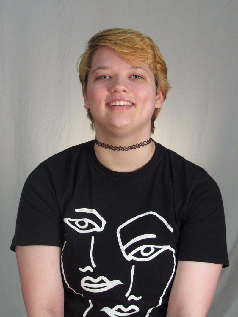
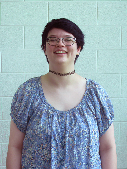
My name is Brianna Gray. Now that it is 2020, I am a junior at Saline High School. I would call myself pretty artsy; I love all things creative, including drawing, painting, photography, and writing as well. I often take photos in my free time. During this class, I hope to expand my photography skills and knowledge even further. I want to take more pictures that I love looking at.
Digital photography has been very beneficial for my photography. Throughout the trimester, I learned new things about taking and editing photos that elevated what I already knew beforehand. For one, this class helped me step out of my comfort zone in terms of taking photos. Before this class, I really only took photos of things I found -- I never really tried to set up a scene. The assignments this class offered for me to choose allowed me to try some things I had never tried to do before. An example of this would be Light Painting, which I had never tried (and barely knew about before this class). Below is my final photo for that assignment.  My photoshop skills have also improved significantly. Before this class, I only knew the very basics of photoshop. Below are my least complicated and most complicated photoshop assignments. The first one was easy, but it took me a little while to complete because I had to get more familiar with the tools. The second one took me a longer amount of time, but I wouldn't be able to have done it without the tools we learned about in this class.
Below are my favorite and least favorite of my photos. Ironically, I think my best photo is my first, and my worst is my most recent photo. However, I believe my Light Painting photos would have turned out much, much worse if I hadn't learned everything about photography that I know today. Light painting made me pay attention to the lighting in manual mode in a dark room, which I couldn't have handled or figured out at the beginning of the trimester.
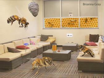
Overall, I'm very happy I took this class. For one, my photoshop skills are elevated to a much higher level. I'm confident in figuring things out on the program to make whatever finished product I need to make. This class also offered up new opportunities in photo-taking that I wouldn't have done otherwise. I'm proud to say that I'm a much more skilled photographer now assignment descriptions:For the Puns assignment, we had to choose three idioms/puns that we could make a visual of. Spoiler alert! I chose: "under the weather," "costs an arm and a leg," and "apple of my eye." After we were done with all three, we combined them into one image. For the Dictionary assignment, we had to choose two descriptive words with which you could fill a picture with examples, while making it visually interesting. I chose "dazzling" and "kaleidoscopic." After we were done with these two, we combined them into one image like the last one. Puns final product: 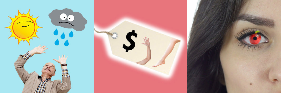 dictionary final product: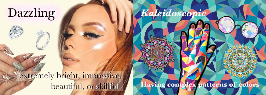 what i learned / reflection:I didn't really learn anything new in this assignment because I was using tools I already knew about, but these projects were good practice. It was good practice especially because I had to cut out a lot of images from their background and make them fit into my picture. The girl's hair on the "Dazzling" dictionary image was especially difficult to cut out, but I think it ended up looking alright. Overall, I liked the creativity and freedom in this assignment, and I'm mostly happy with my finished products.
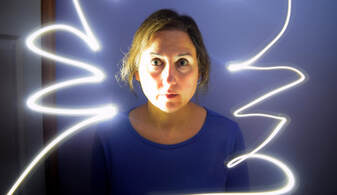
assignment description:To paint with light, you have to get in a very very dark room and leave the shutter open for several seconds. While the shutter is open, you move around a light (I used the flashlight on my phone), and wherever you draw it, it will show up on the finished photo. We went in my bathroom (even though it was a pretty tight space), because that's the only room we have without any windows or daylight coming in. For most of the photos, I left the shutter open for around 4/5/6 seconds. best photo (unedited):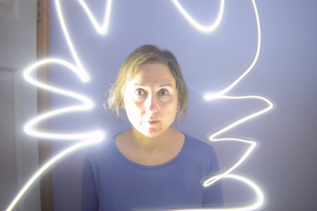 best photo (Edited): Aperture: f/3.8 Shutter speed: 4.0 ISO: 200 I messed with the levels a lot to get better contrast, and cropped it down from the top because I felt there was too much headroom. other best photos: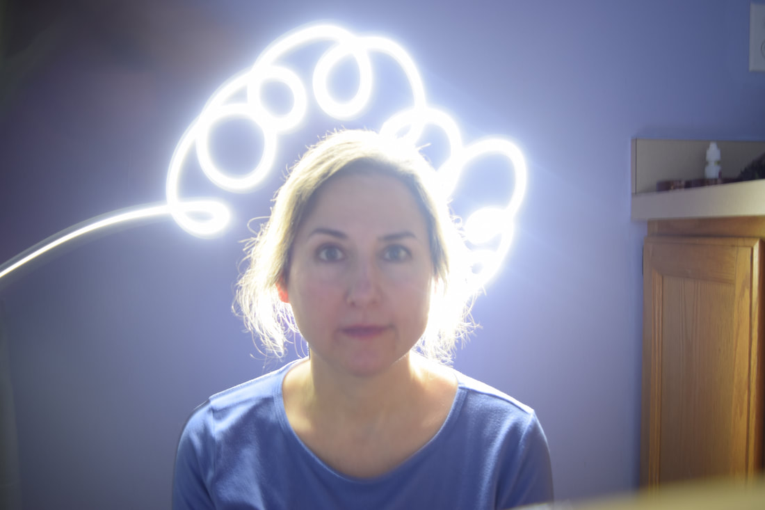 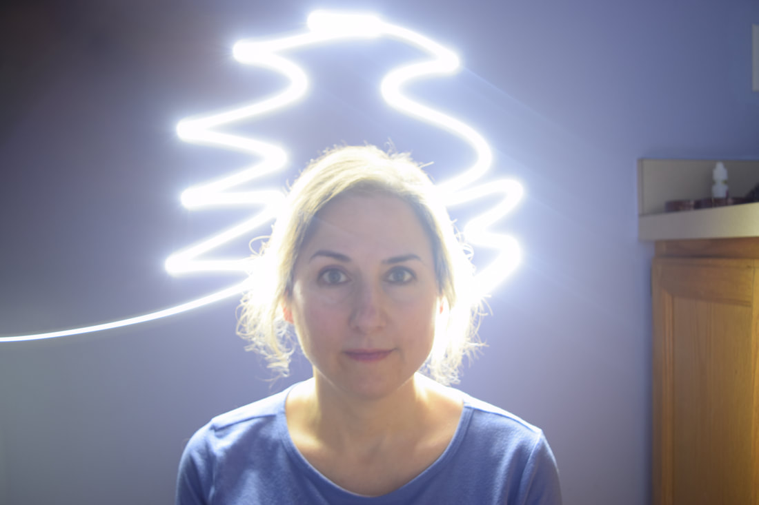 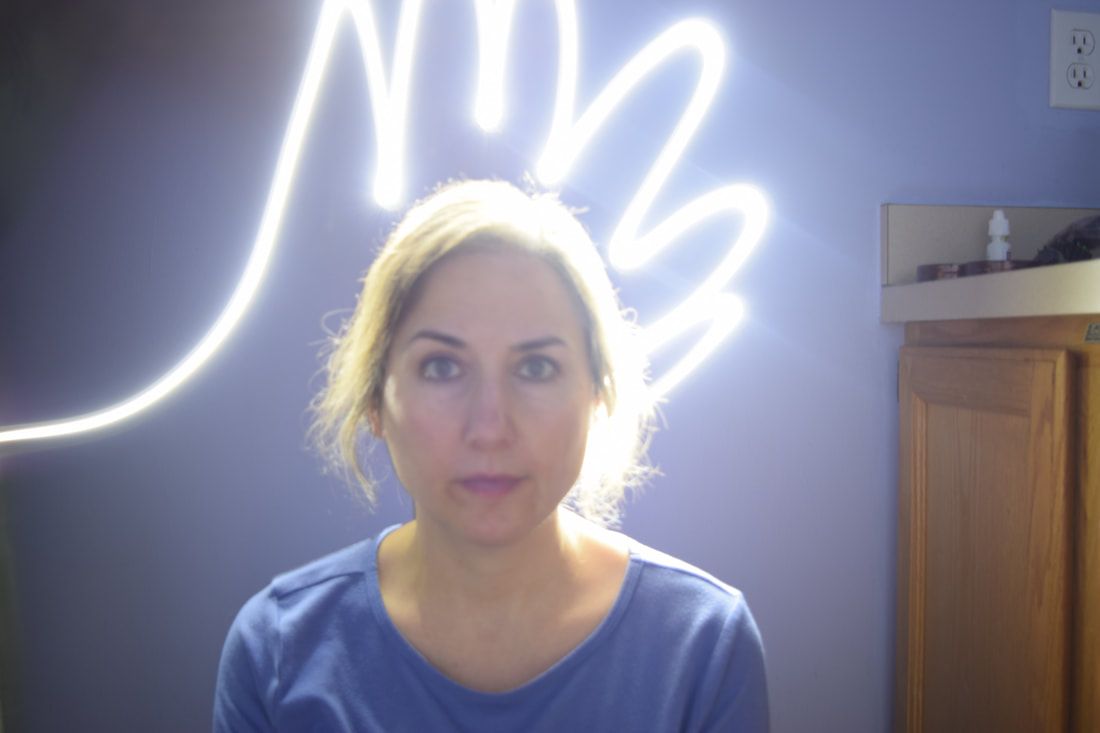 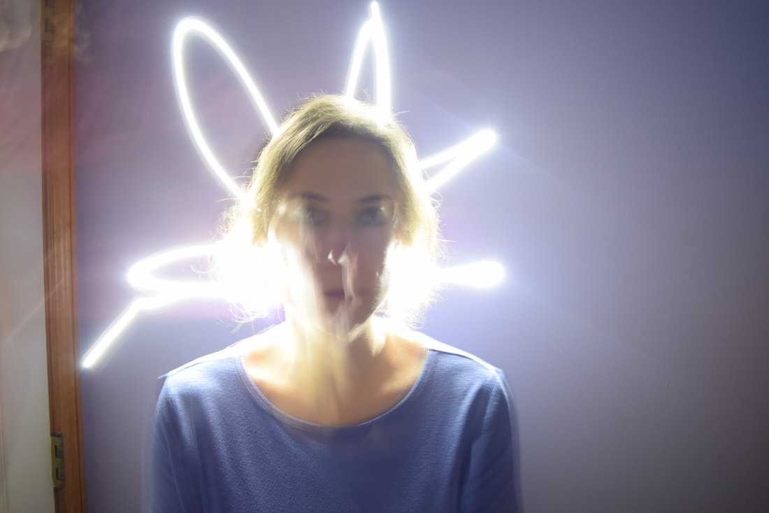 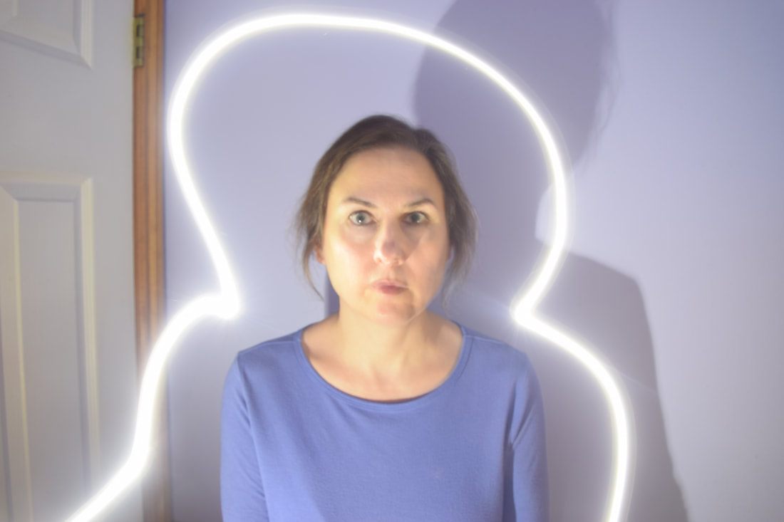 what i learned / reflection:I learned that light painting is way harder than it looks! I struggled to get most of the photos in focus because I forgot I could switch to manual focus. Also, I was on shutter priority mode, which was a mistake... the aperture ended up being too open, and a lot of my photos were overexposed. I would definitely want to redo this assignment if I could, because I recognize what I was doing wrong.
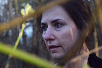
assignment descriptionFor this assignment, we had to take two portrait photos. One was in the studio, and one was outside of the studio. In the studio, we used lights to brighten up both sides of the face. Outside of the studio, we used a bounce card to illuminate the shadowed part of the subject's face. Then, in Photoshop, we edited them into white frames on a black background. starting images:
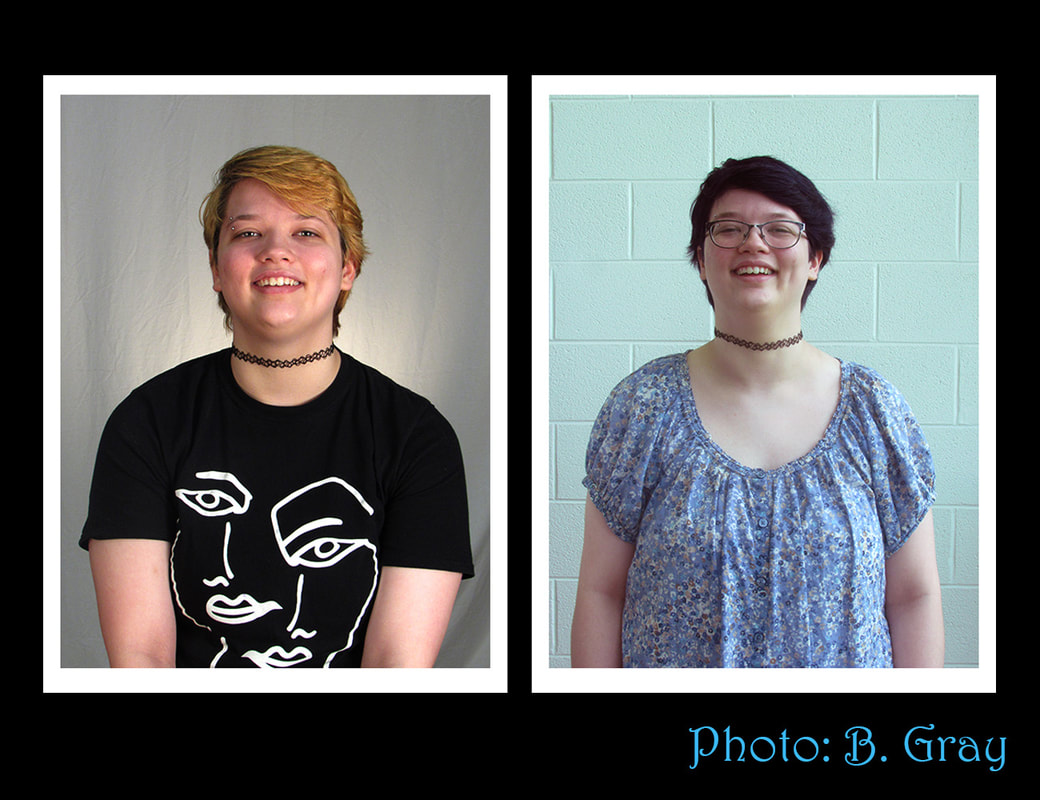 what i learned / reflection:I have never taken pictures in a studio before, so this was an interesting new thing to try! I also never knew about bounce cards -- they make a surprising difference for just being white sheets of paper. This assignment was pretty fun, and I didn't think it was very difficult. The only thing I struggled with was white balance. When I took my photos outside of the studio, it was on the wrong setting, so I had to do quite a bit of color correcting in photoshop.
assignment description:For this assignment, we were to take pictures of buildings that showed their beautiful or interesting architecture. I walked around downtown Saline with Ezra (check out their blog here!) and scouted out buildings that were pleasing to the eye. We took the photos midday in full sunlight. best photo: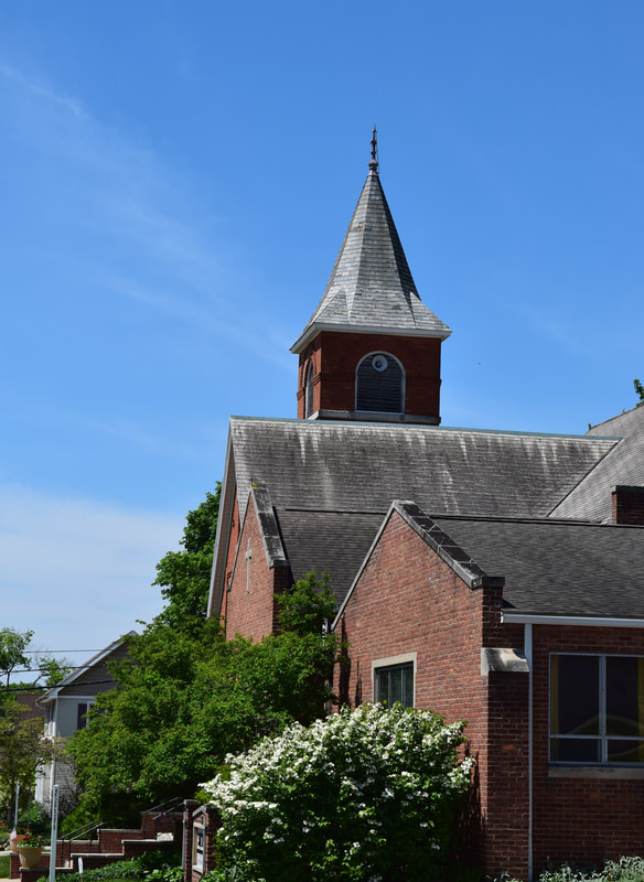 Aperture: f/11.0 Shutter speed: 1/500 ISO: 220 No edits done. other best photos: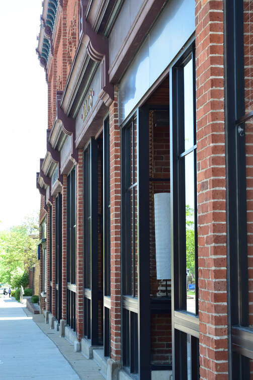 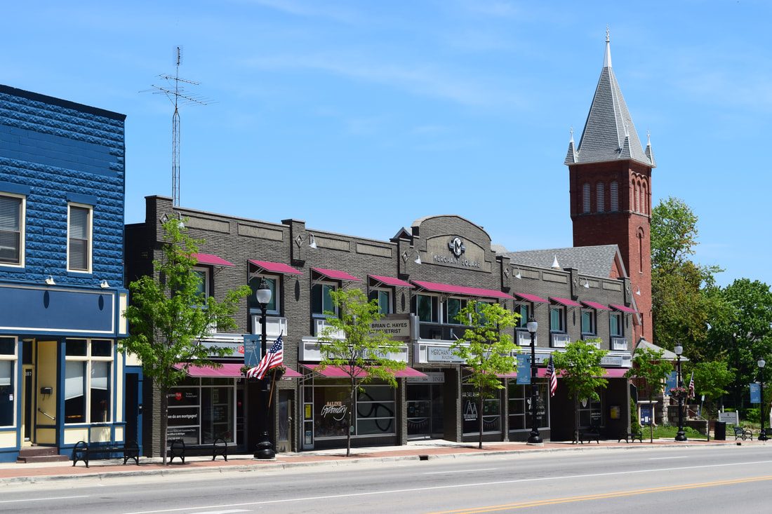 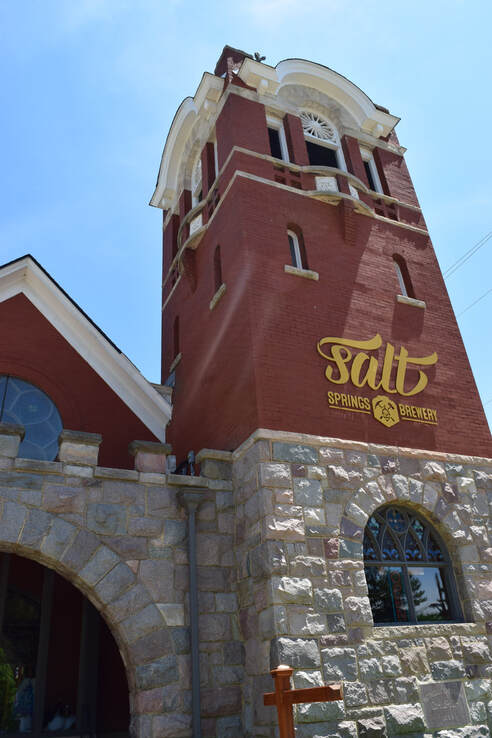 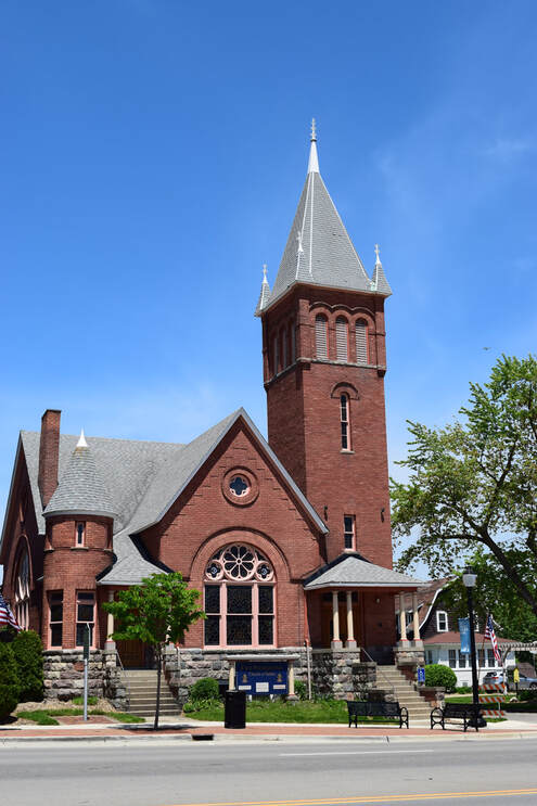 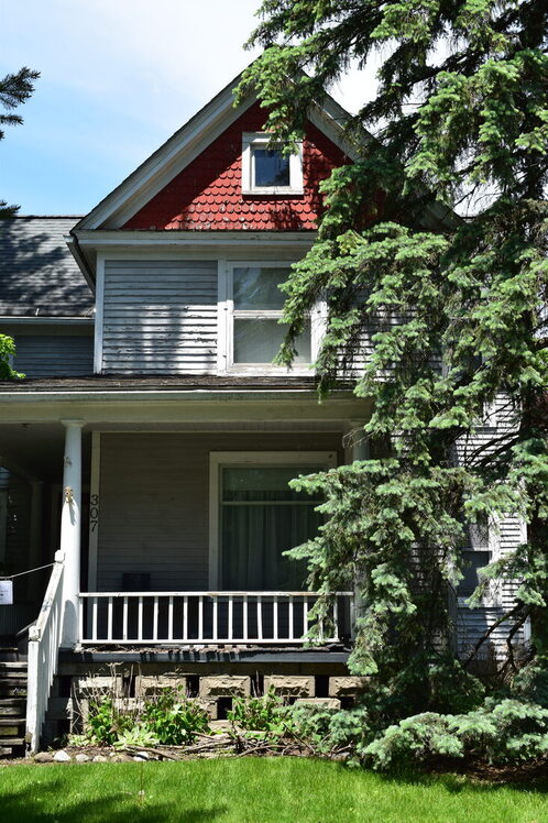 what i learned / reflection:I learned that it can be a challenge to take good photos of buildings. I was lucky in that the sun was out, so there was nice lighting in the photo -- because you can't really control the light outside, you just have to take whatever you're given. Also, it's important to think about the angles when you take pictures of buildings because it can really drastically change the photo.
assignment descriptionFor this assignment, we were to go through a number of Photoshop tutorials and follow them to our best ability. The first one we had to do was "dash of color" -- where we made a photo black and white and then used the history brush to bring back a section of color. After this tutorial, we were free to choose some tutorials we wanted to do from the internet.  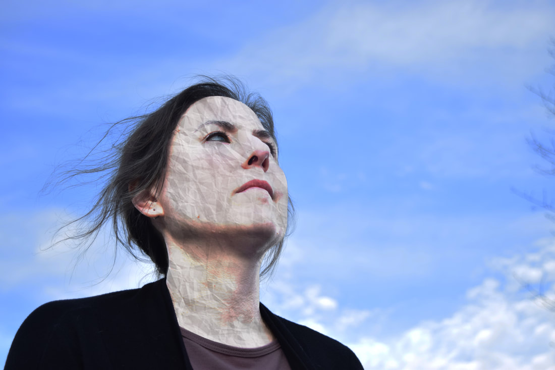 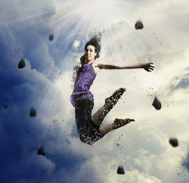  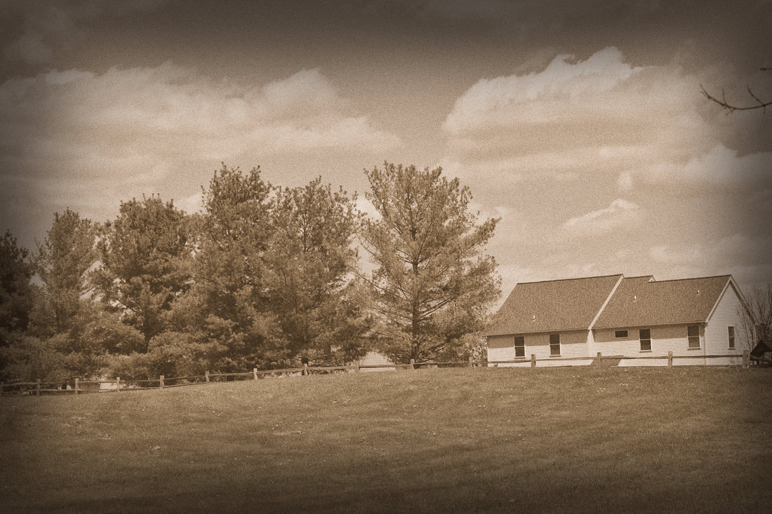 what i learned / reflection:Going through all these tutorials really helped me find out about tools Photoshop had that I hadn't known about beforehand. For example, in the second picture (the paper textured-face one), I learned about the RGB channels. In the last photo, I learned about the filters you can use (I used a sepia and grain filter). Overall, this assignment strengthened my Photoshop skills.
|